Best Fonts for Meta Ads in 2026

Best Fonts for Meta Ads in 2026
Ad typography isn’t brand typography.
People don’t read ads carefully.
They recognize them instantly while scrolling.
If a font slows understanding, performance drops.
———-
What Actually Works
High-performing ad fonts share a few traits:
large x-height
open shapes
bold weights
clear numbers
Thin or decorative fonts usually lose attention before the message lands.
———-
Reliable Font Picks
Inter

Safest default. Extremely readable everywhere.
Manrope

Modern but still clear. Good for DTC.
DM Sans
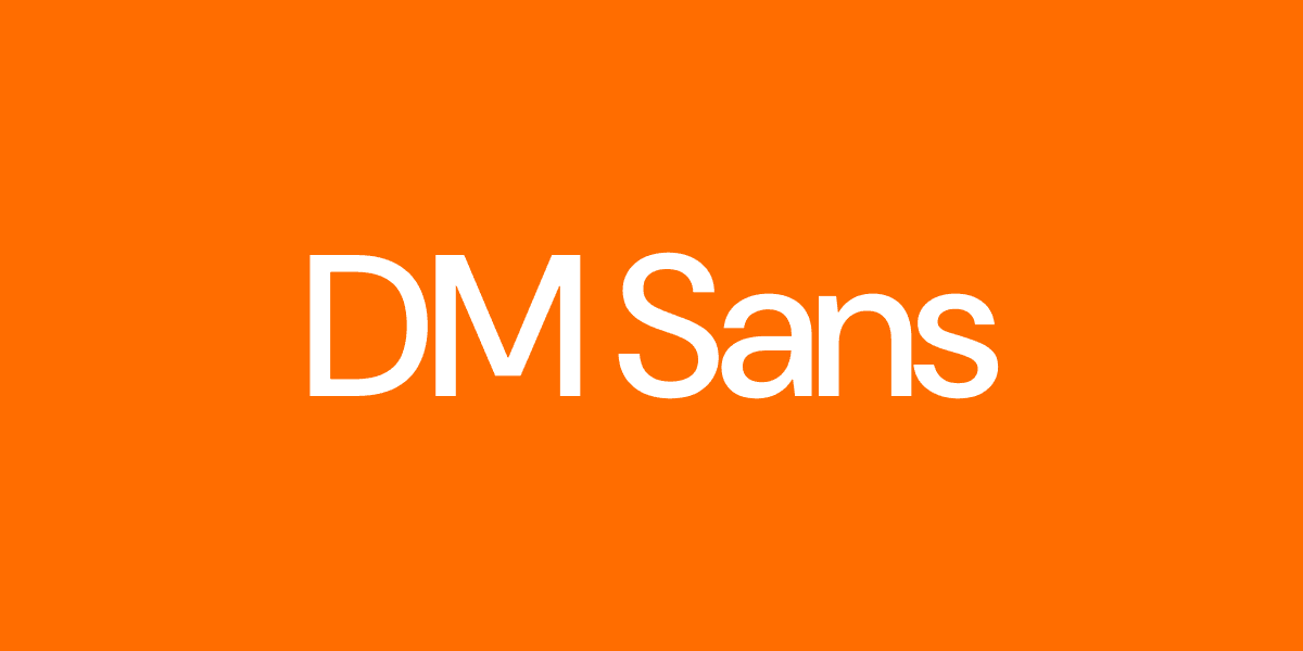
Friendly. Good for testimonials.
Archivo
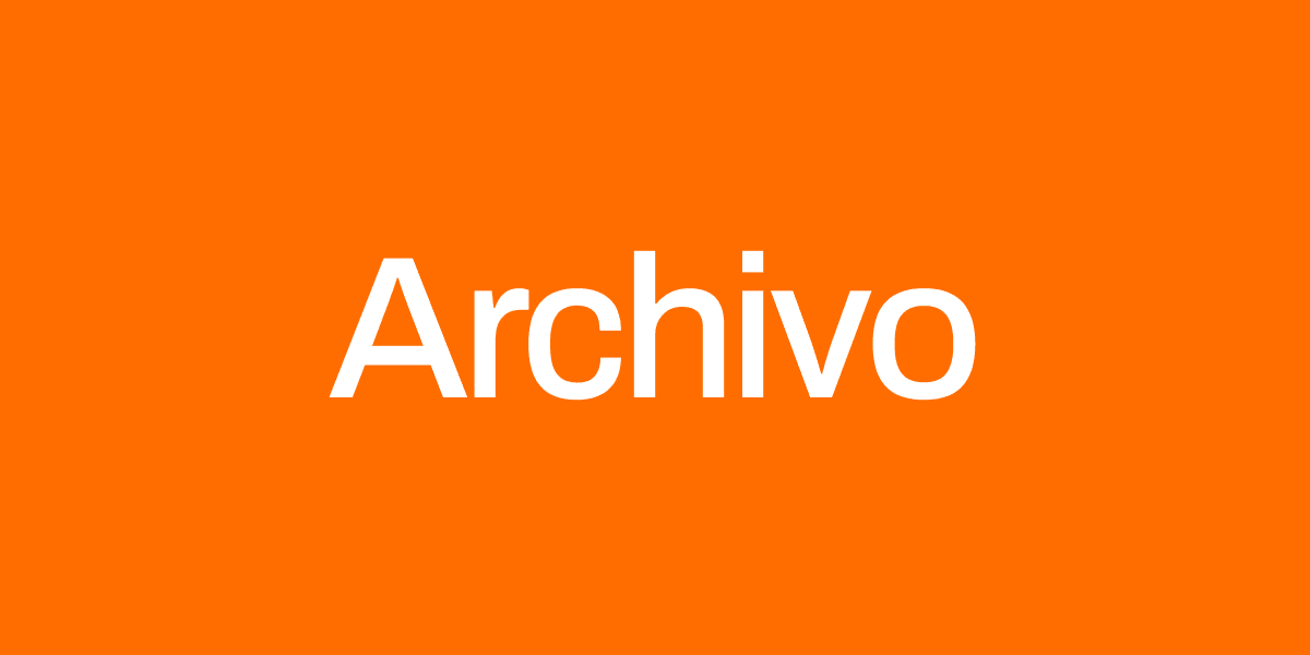
Structured. Good for stats and proof.
———-
Fonts That Hurt Performance
thin sans serif
scripts
condensed body text
delicate serifs
They break in fast mobile viewing.
———-
Simple Rules
Big headlines
Bold weight
Strong contrast
Obvious numbers
Users don’t read ads.
They decode them.