Anatomy Of A Scroll-Stopping Static Ad

Written By
Armend Meha
A static ad has less than a second to justify its existence...

Anatomy Of A Scroll-Stopping Static Ad
A static ad has less than a second to justify its existence. The thumb is already moving. The feed is a firehose of birthday photos, hot takes, and forty other ads that all learned the same tricks. So when someone actually stops — really stops, pupils locked, thumb frozen mid-swipe — something specific happened. It wasn't luck. It was design doing its job.
We design a lot of statics. Thousands a year, across D2C brands and the agencies that white-label us. And the thing we keep coming back to is that a great static isn't "a nice image with words on it." It's a tiny machine with parts, and every part has a job. When one part slacks off, the whole thing coasts past the eye and dies quietly in the feed.
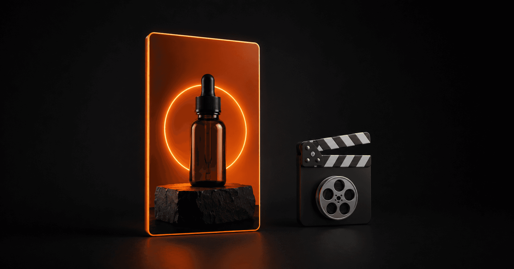
So let's take one apart. We'll deconstruct an imaginary-but-typical high performer — a skincare serum static, because it's a category where everyone's ad looks like everyone else's ad — and go frame by frame through what earns the pause. Steal any of it.
First, What "Scroll-Stopping" Actually Means
Let's kill a myth up front: scroll-stopping is not the same as loud. We've all seen the neon-gradient, seventeen-fonts, "LIMITED TIME 🔥🔥🔥" ad. It's loud. It stops nobody. It reads as noise, and the brain is exquisitely good at filtering noise.
Stopping the scroll is about creating a pattern interrupt — something that doesn't match the rhythm of the feed the eye was expecting. The feed has a texture: casual photos, predictable ad layouts, a certain visual cadence. A great static breaks that cadence for a fraction of a second, and that fraction is the whole game. The pause is the win. Everything after the pause — the read, the click, the conversion — depends on it happening first.
So the anatomy we care about is the anatomy of earning that pause and then not wasting it.
Part 1: The Focal Point (Where The Eye Lands)
Open our serum ad. Before any conscious thought, the eye lands somewhere. That landing spot is the single most important design decision in the whole frame, and most ads never decide it on purpose — they let the layout decide by accident, which usually means the eye lands nowhere and bounces off.
In our static, we've made the bottle the hero and given it one clean job: be unmistakably the brightest, sharpest, most-in-focus thing in the frame. We shot it (or comped it) against a background that's slightly darker and softer, so it sits forward. There's a subtle drop shadow and a hint of glow around the cap — not a Photoshop-2007 glow, just enough separation that the object feels three-dimensional and lit.
The rule we design by: one hero, one hierarchy. If two things fight to be the focal point, neither wins. We've killed more "cluttered" ads by simply deciding what the eye should hit first and demoting everything else.
Part 2: The Hook Text (The Three Words That Do The Heavy Lifting)
Now the eye has landed. You've got maybe another half-second before it decides whether to stay. This is the hook text's moment.
On our serum static, the hook reads: "Bright by Friday." Three words. Big. Top-left, because that's where Western eyes travel after the focal point. Here's what makes it work as design, separate from copy:
It's short enough to read pre-consciously. If the viewer has to actually read — process a sentence — you've already lost the ones who were mid-swipe. A hook should be absorbed like a road sign, not read like a paragraph.
It's set in one confident weight, one typeface. Big, heavy, tight leading. No competing sizes within the hook itself.
It has contrast against whatever sits behind it. We either place it on clean negative space or drop a subtle scrim behind it. White text on a busy midtone photo is the single most common reason a hook becomes invisible.
We'll say this to any founder who'll listen: the copy team writes the hook, but the designer decides whether anyone can read it in a moving feed. Those are two different jobs and both have to land.
Part 3: Contrast (The Physics Of Getting Seen)
Contrast is the unglamorous workhorse of scroll-stopping. It's not one thing — it's several kinds working together, and we tune all of them:
Tonal contrast — light against dark. The bottle is bright, the backdrop recedes. The hook is high-contrast against its immediate surroundings.
Color contrast — our serum is warm amber, so we set it against a cool, desaturated background. Complementary temperature makes the hero pop without any gimmicks.
Contrast against the feed itself — this is the sneaky one. Social feeds skew toward bright, busy, high-saturation everything. So sometimes the boldest move is restraint: a calm, spacious, slightly-underexposed frame in a sea of clutter reads as a pattern interrupt precisely because it's quiet. We've A/B'd this more than once and watched the "boring" clean version out-stop the loud one.
The mistake we see constantly: designers max out saturation on everything, trying to make it all pop. When everything pops, nothing does. Contrast is a budget. Spend it on the hero and the hook. Starve the rest.
Part 4: The Thumb-Stop Moment (The Little Tension)
Here's the part that separates a competent static from one that actually stops thumbs. We call it the thumb-stop moment: a small hit of curiosity, tension, or "wait, what" that the eye can't resolve in a single glance — so it has to linger to figure it out.
In our serum ad, it's a tiny detail: the before/after isn't two side-by-side headshots (predictable, skippable). It's a single face where the visible improvement is subtle enough that you look twice to confirm you're seeing it. That second look is the pause. That's the whole trick.
Thumb-stop moments come in a few flavors we reach for:
A visual question. Something slightly unexpected — an object where it shouldn't be, a scale that's off, a texture that demands a closer look.
A pattern break inside the ad. Nine identical items and one that's different. The eye is a difference-detecting machine; give it a difference and it stops.
Motion implied in a still. A drip caught mid-fall, powder frozen mid-splash. Static frames that imply a moment of action borrow the attention-grabbing power of video.
A human micro-expression. A real, slightly-off, un-stocky face. We hunt for the frame where a person looks like a person, not a model — that flicker of authenticity reads as "this is real" and buys a beat of attention.
The key is one thumb-stop moment, not five. It's a hook, not a scavenger hunt.
Part 5: The Read Path (What Happens After The Pause)
Say we won the pause. Great. Now we've got roughly two seconds of borrowed attention, and the layout has to spend it in the right order. This is where hierarchy earns its keep.
We design the read path deliberately: hero → hook → one proof point → one CTA. In our serum static, that's: the bottle grabs you, "Bright by Friday" tells you the promise, a small badge ("clinically tested, 2-week results") makes it believable, and a modest button-styled prompt tells you where to go next.
Notice what's not in there: three feature bullets, a founder's origin story, five icons, and a coupon. Every extra element taxes the read path. We treat the static like a doorway, not the whole house. Its only job is to earn the click; the landing page can do the explaining.
Which is a good moment to say: a scroll-stopping static that dumps traffic onto a slow, mismatched landing page is a beautiful front door bolted to a broken building. We design the two as a pair whenever we can — same hook, same promise, same visual language carrying from feed to page — because the "message match" between the ad and the page is where a lot of would-be conversions quietly leak away.
Part 6: Designing For The Format, Not The Artboard
One more part of the anatomy, and it's the one most likely to get skipped: the frame has to survive its actual habitat.
We design and review every static in a mock feed on a phone, not zoomed-in on a desktop artboard where everything looks gorgeous and legible. On the phone, at real size, thumb hovering, is the only test that matters. Text that looked bold at 100% becomes a smudge at feed size. That elegant thin serif? Gone. The clever detail in the corner? Cropped by a UI element or lost in the scroll.
Our checklist before anything ships:
Does the hook read at a glance on a phone, at arm's length, in bright light?
Is the hero unmistakable in the first 0.5 seconds?
Does it hold up as a square, a 4:5, and a 9:16 story crop — with the important stuff inside the safe zone?
Does it look like itself next to the brand's other ads, so the account builds recognition instead of chaos?
The Whole Skeleton
So here's the anatomy, laid out on the table: a focal point that decides where the eye lands, a hook that's absorbed not read, contrast tuned to the hero and to the feed around it, one thumb-stop moment that buys a second look, a clean read path that spends the borrowed attention wisely, and a build that's tested in its real habitat.
Miss any one and the static still exists — it just doesn't work. It'll get impressions and no pauses, which is the most expensive kind of pretty.
The good news is that none of this is magic. It's craft, and craft is repeatable. It's also why we can knock out variations fast without them turning to mush: once you know the parts, you can swap a hook, re-tune contrast, or move the thumb-stop moment and generate ten genuinely different concepts instead of ten recolors of the same one. That's the muscle behind creative testing velocity — but that's a different post.
For now: go look at your best-performing static and take it apart. Find the pause. Then ask which of these parts is actually doing the work — and which ones you got lucky with.